Sustainability is the design of our future generations.
A space should reflect the brand and the people within it. Therefore, I chose to incorporate eco-friendly design elements to align with TooGoodToGo’s values in their new restaurant.
- Too Good To Go Restaurant Interior Concept -
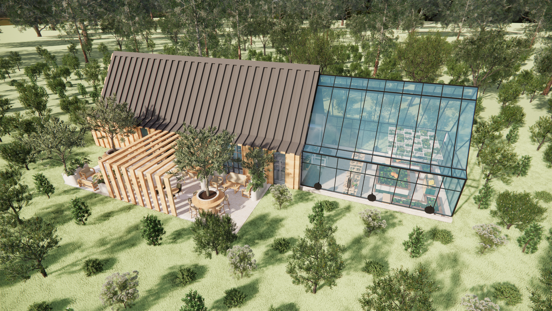
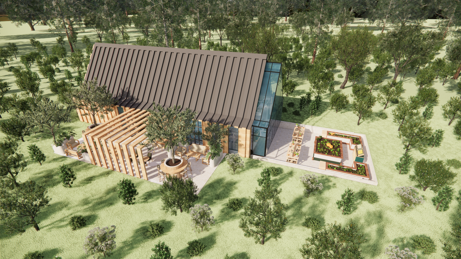
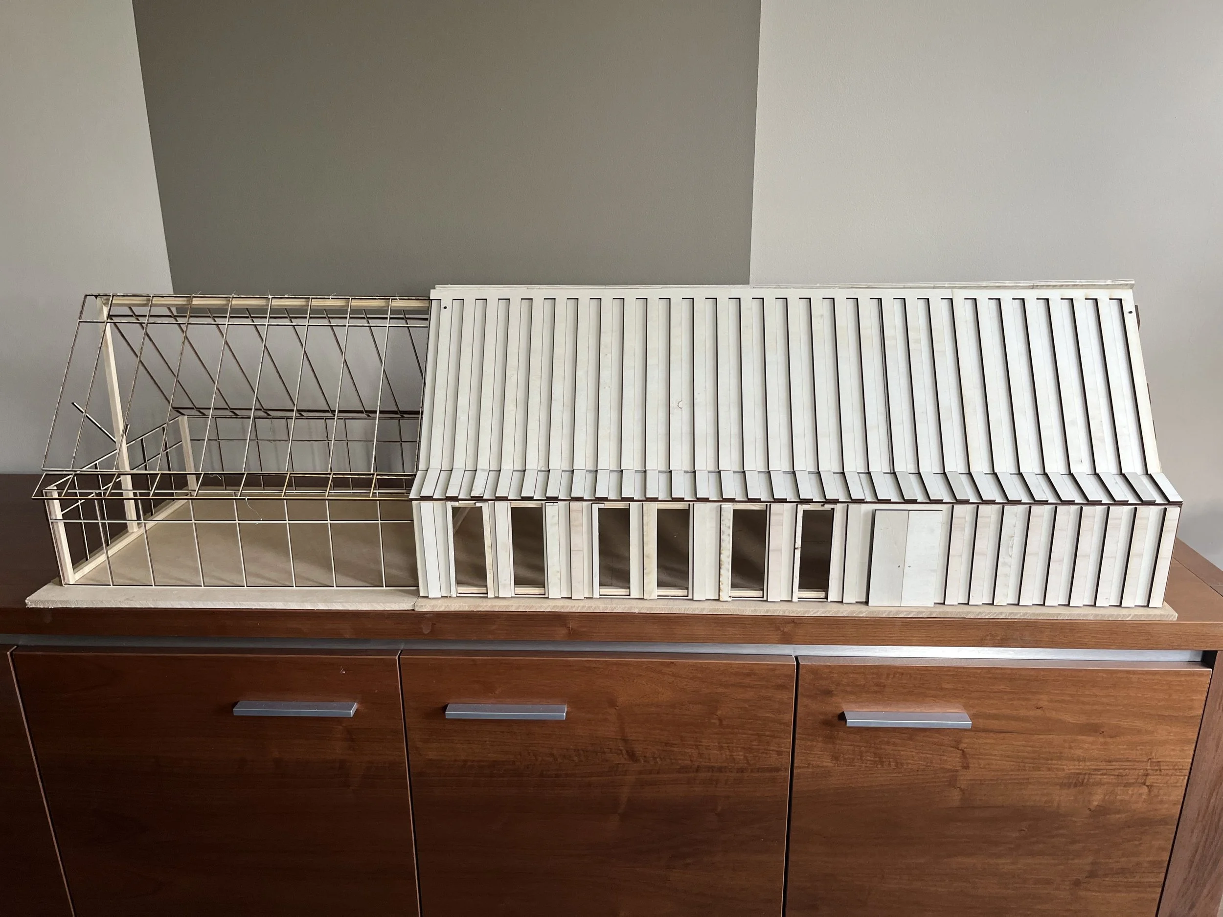
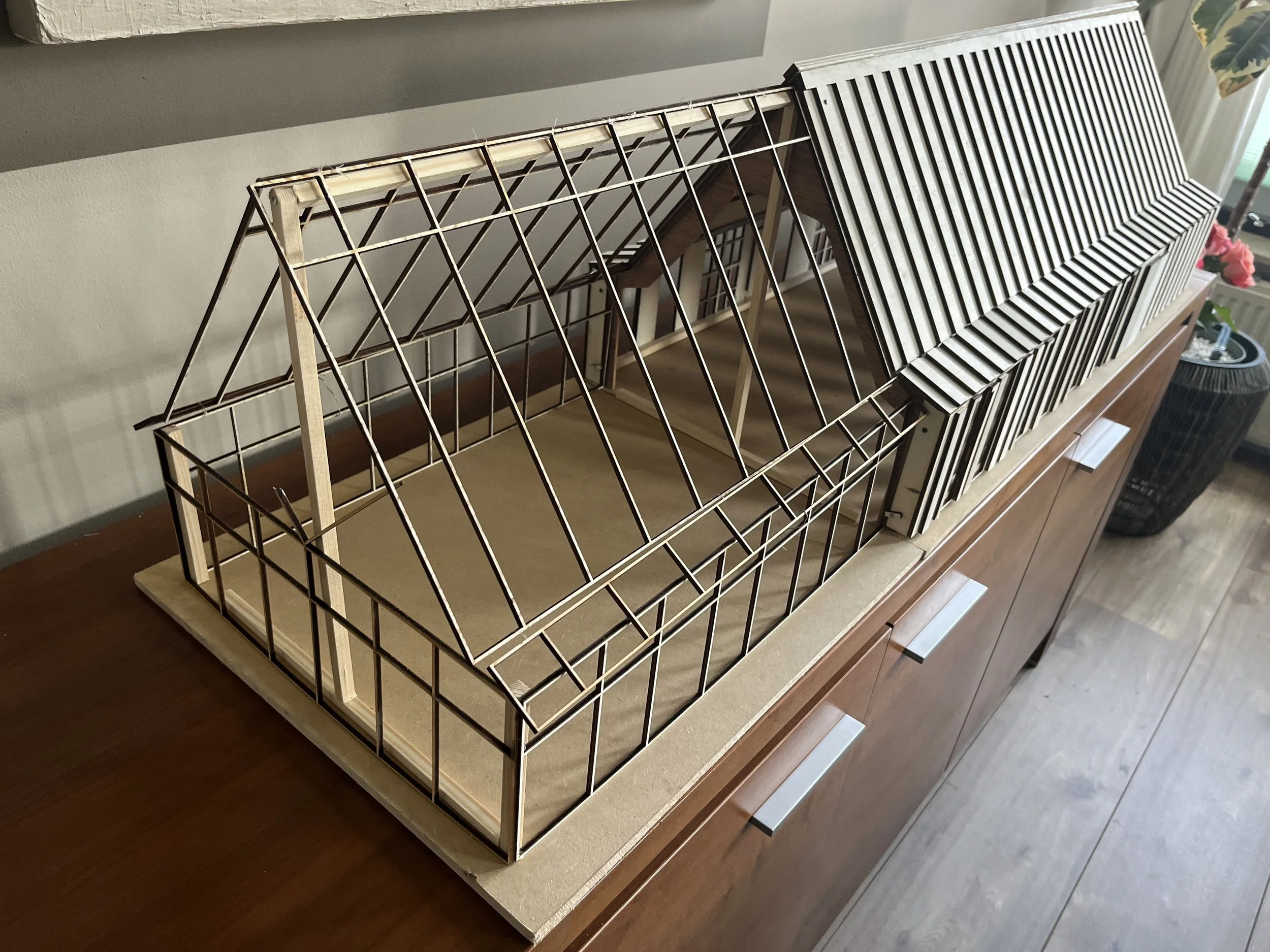
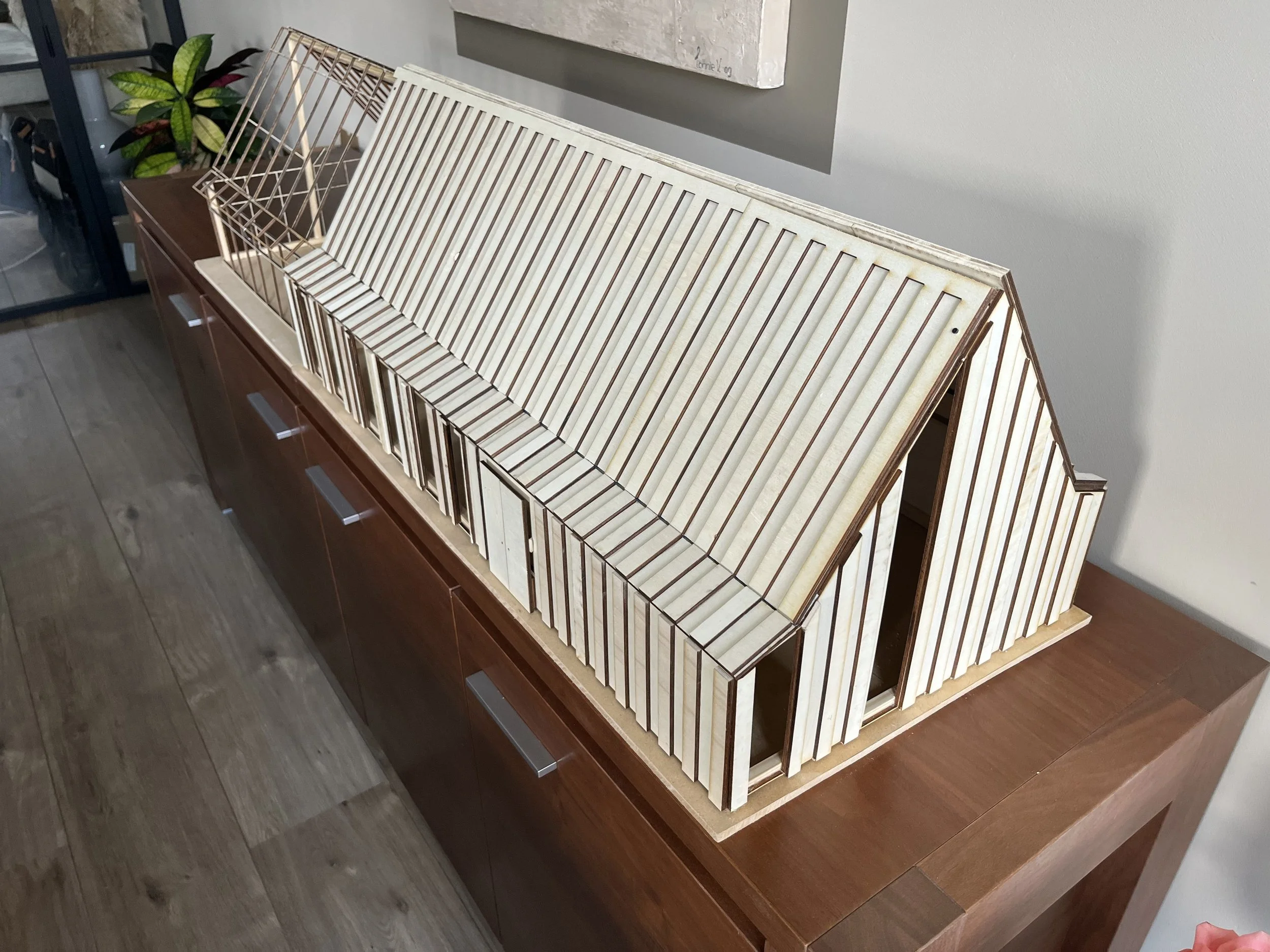
This project focuses on designing a Too Good To Go restaurant located in an old farmhouse. The interior translates the brand’s core values, conscious use of products, support for local production, and the reduction of food waste, into a spatial experience. Rather than being explicit, the space subtly tells this story through atmosphere, material choices, and spatial logic.
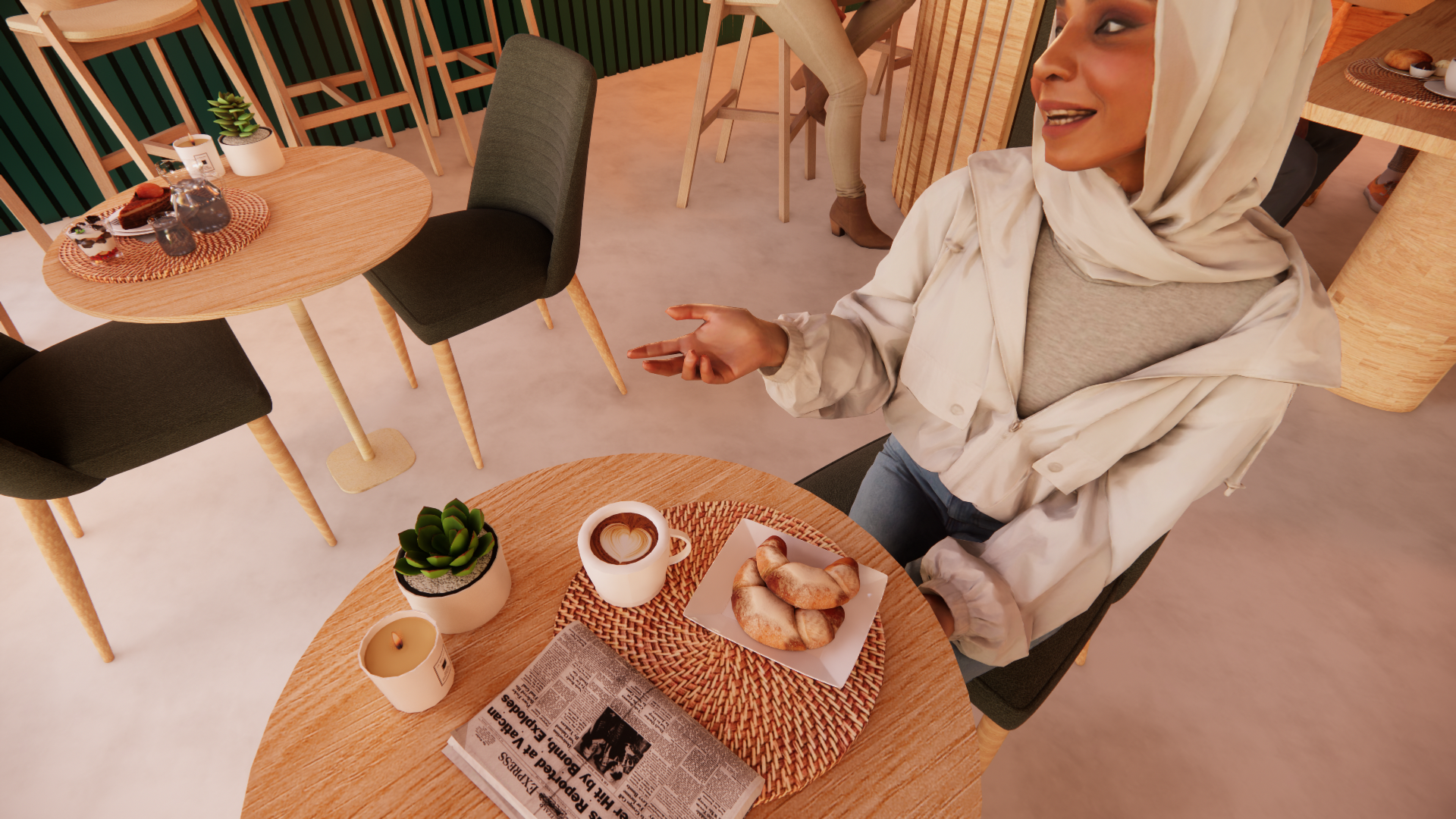
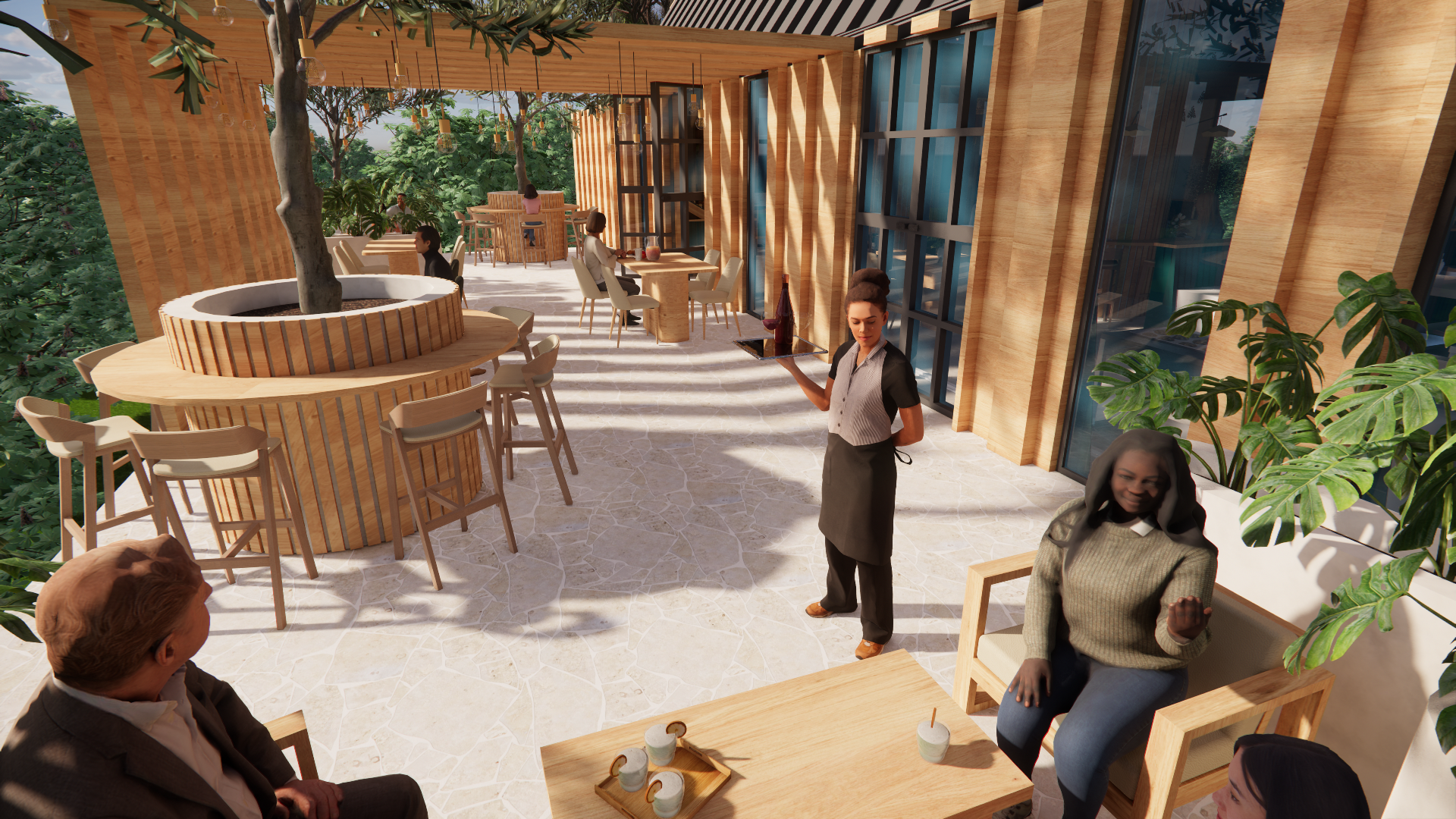
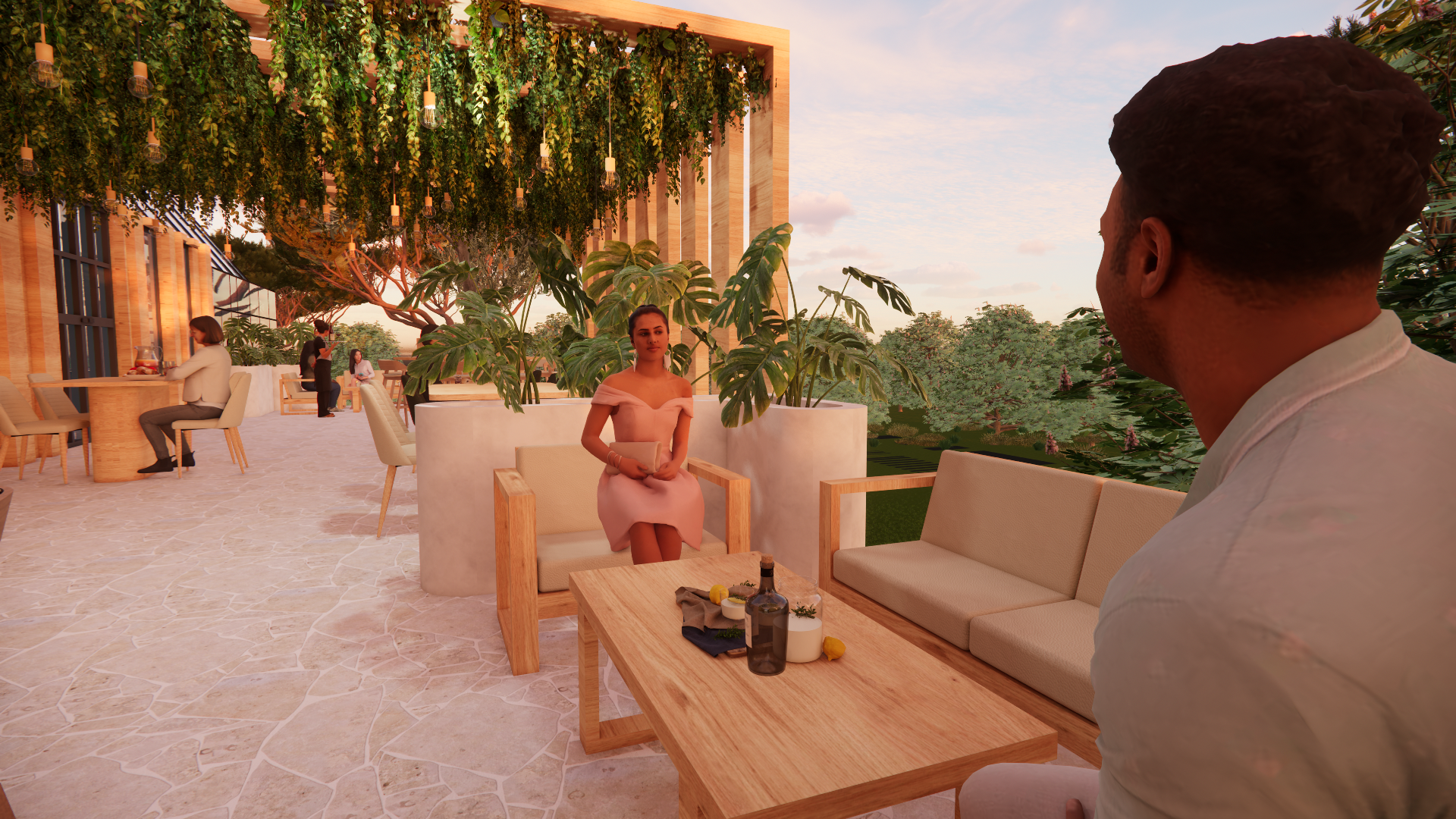
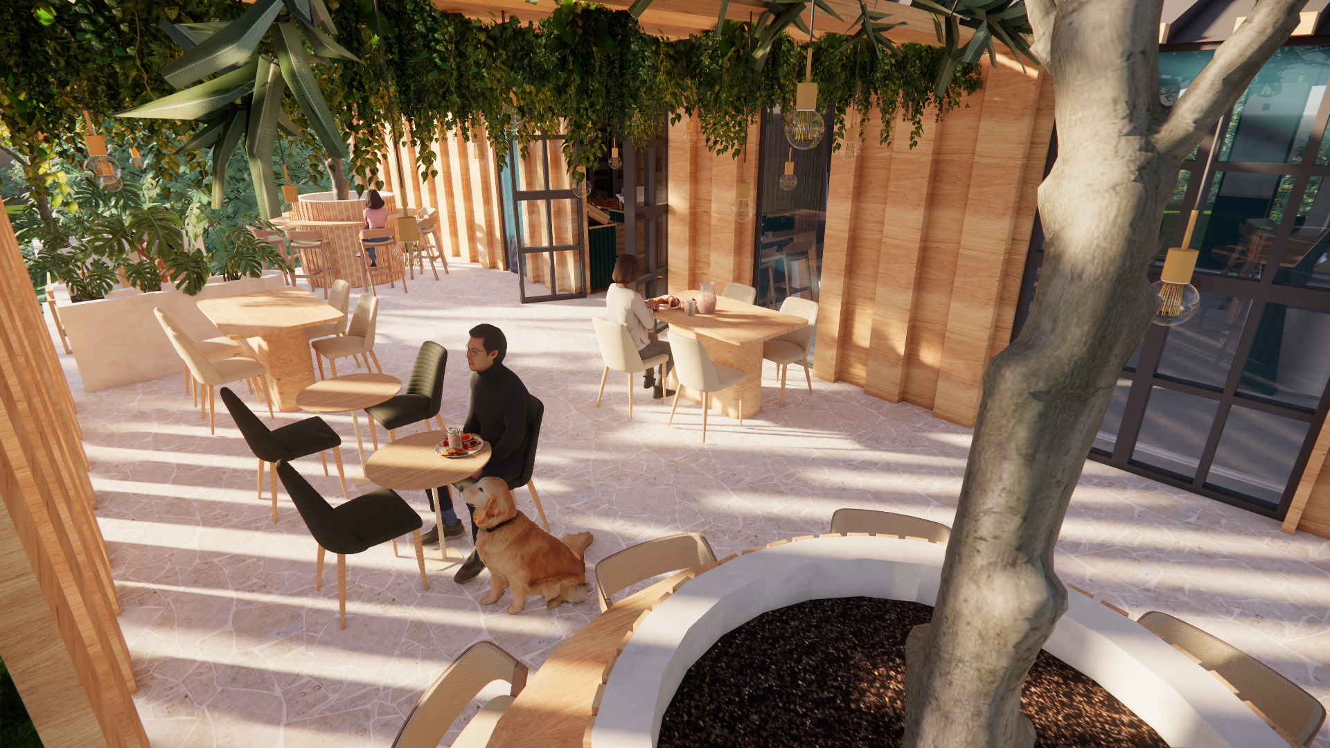
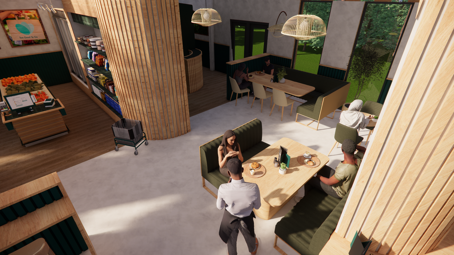
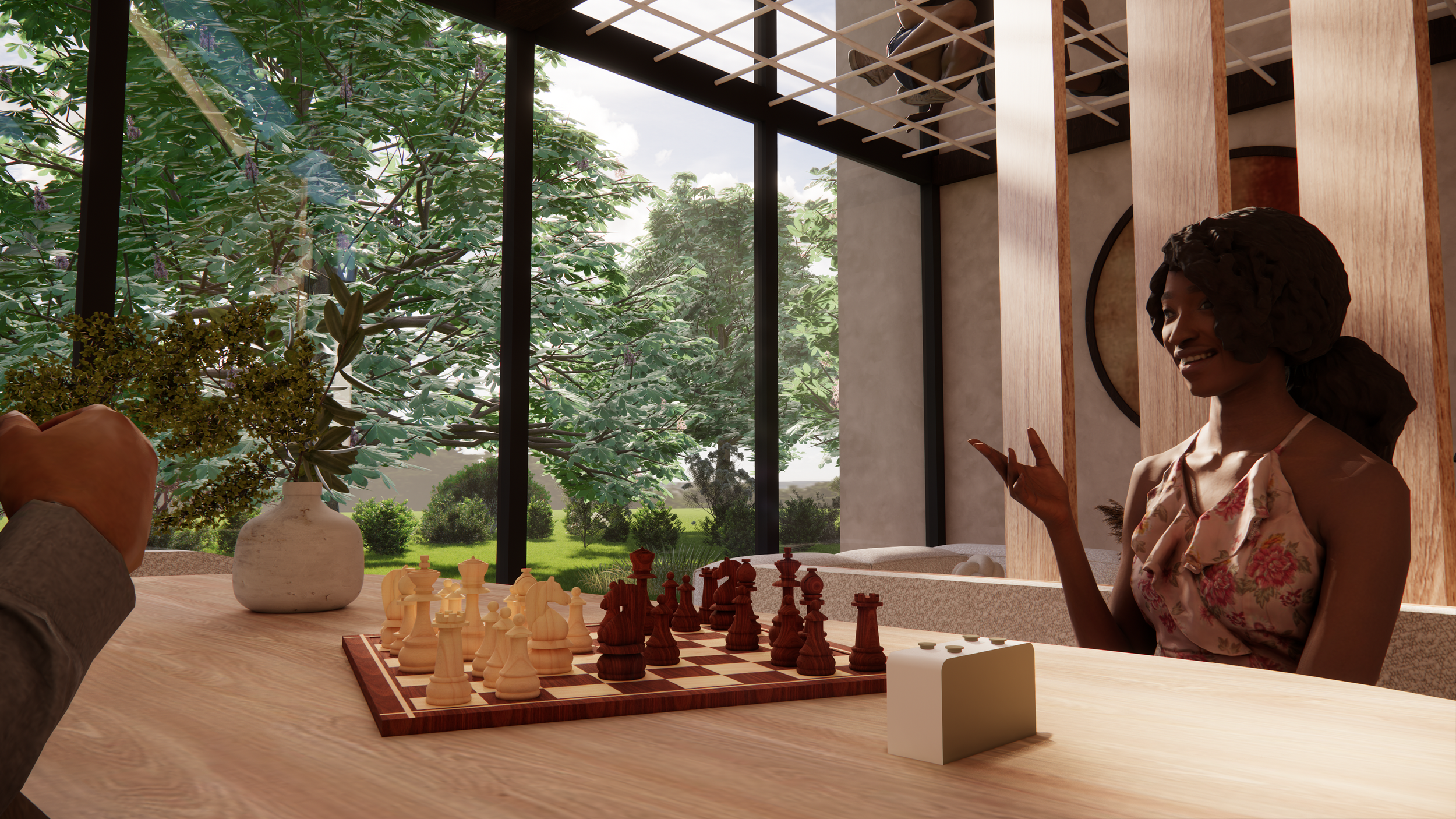
The restaurant is designed to be accessible and welcoming to everyone. Whether guests stop by for a quick meal or stay longer, the space offers comfort and ease. An open and coherent layout ensures smooth circulation, while light, materials, and proportions work together to create a calm and inviting environment.
The aesthetic is botanical, serene, and audience-focused, featuring natural color palettes, abundant greenery, and tactile materials that are both durable and timeless. Functionality and flexibility are key: modular furniture allows the space to adapt effortlessly to different times of day and events, while the layout supports accessibility for visitors of all ages and mobility levels.
Overall, the design creates an airy and open restaurant environment where sustainability is not only a concept, but something that can be seen, felt, and experienced a place where atmosphere, function, and storytelling come together naturally.
- QR-Code Panorama photo’s -
To enhance the experience of the interior, you can scan the QR codes, which will redirect you to Chaos.com. There, you can explore high-quality rendered images that give the impression of being inside the space.

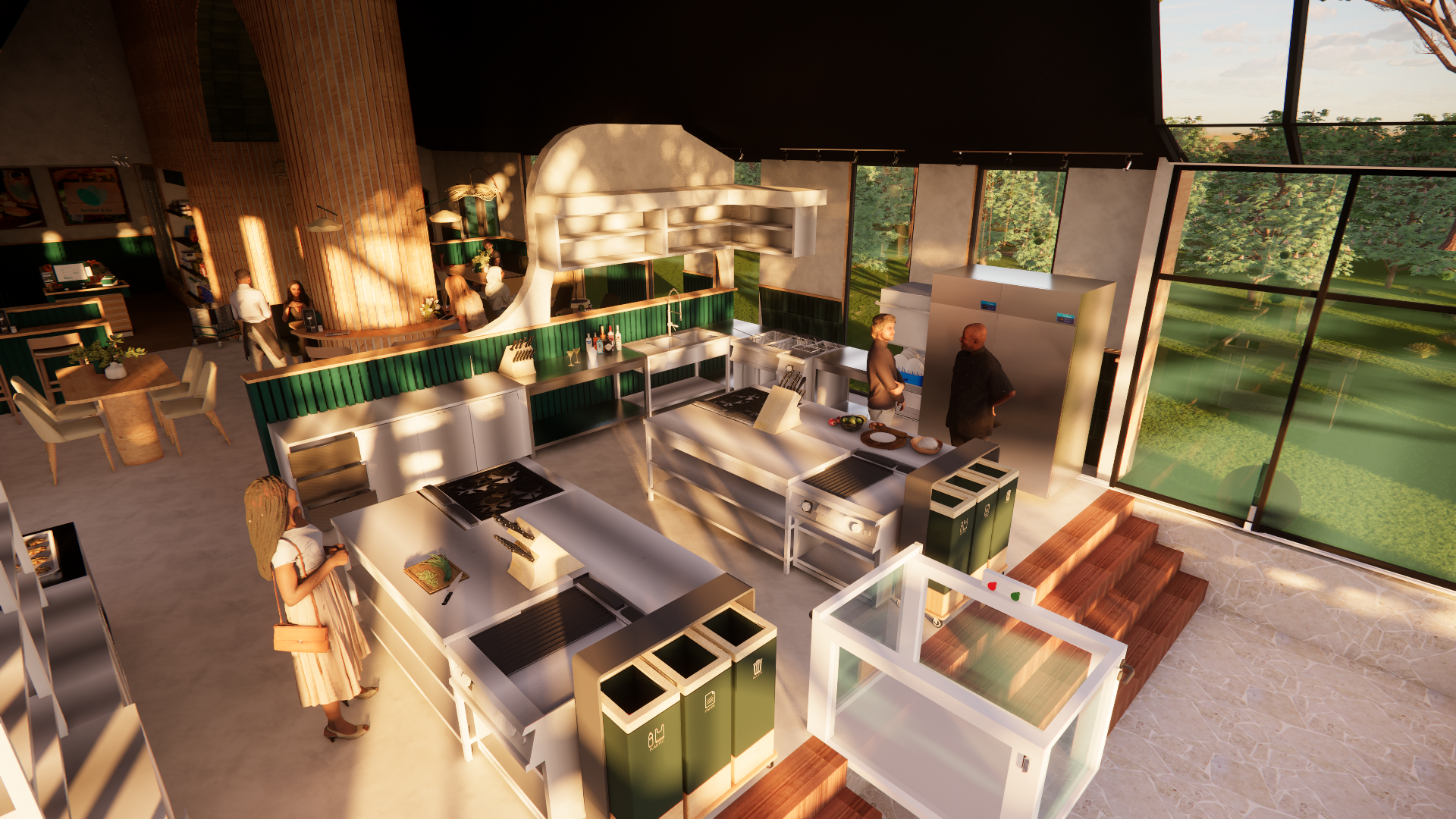
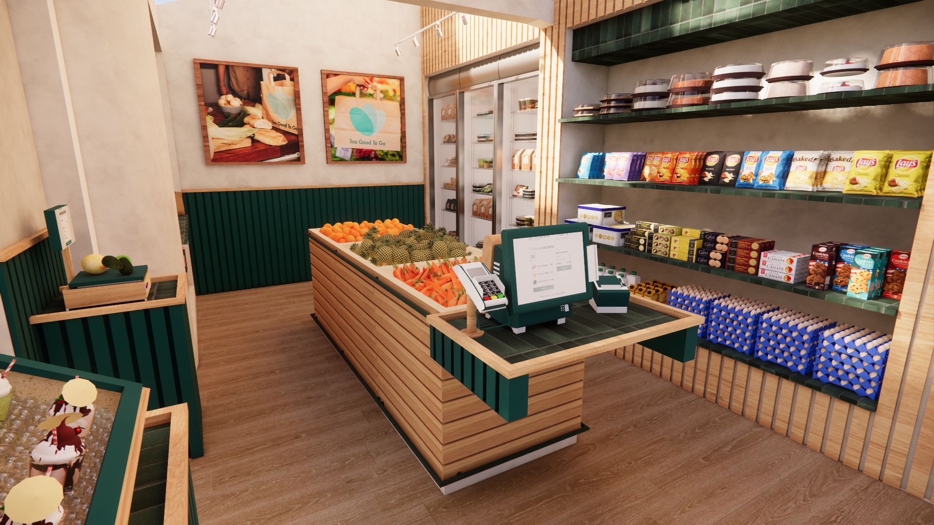
Too Good To Go supermarket and dining tables

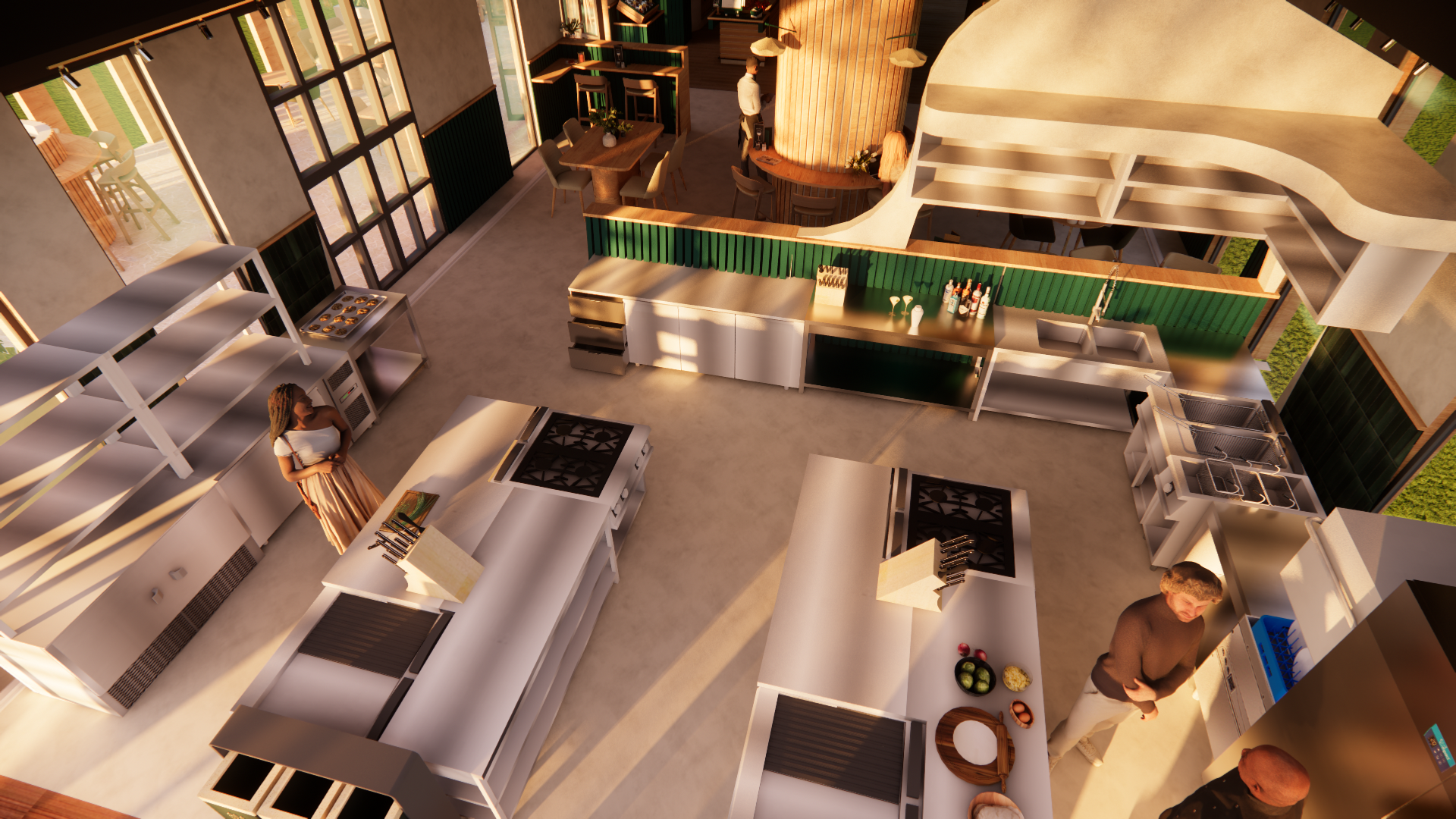
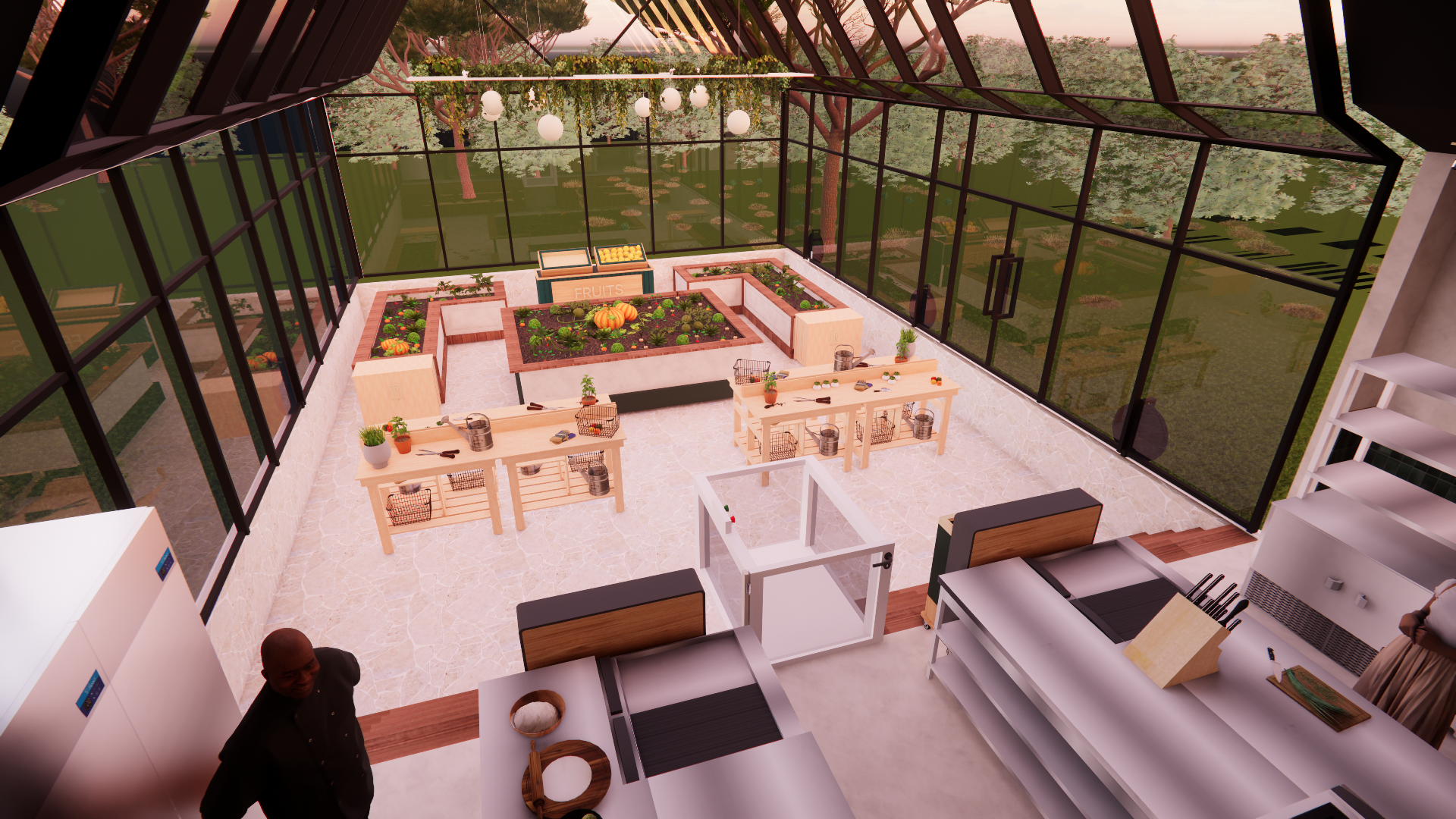
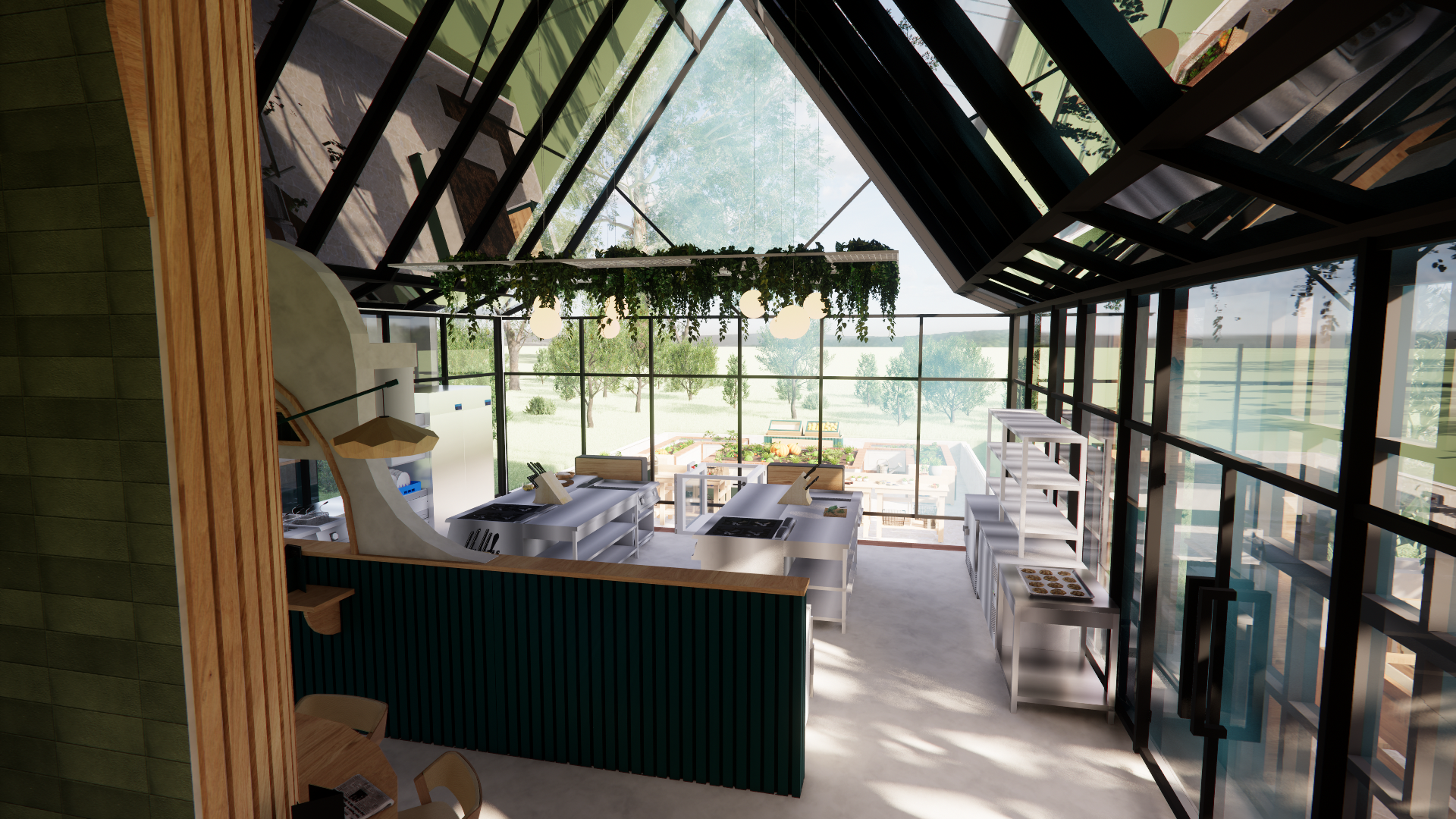
Kitchen and greenhouse
Click or Scan
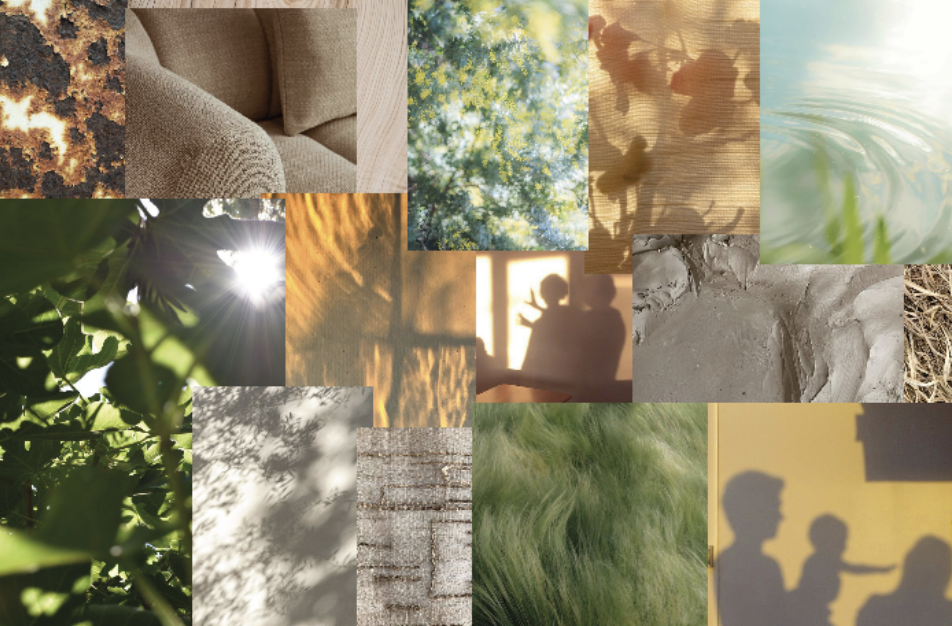
- Moodboard -
Calming, harmony, balance, character, personality
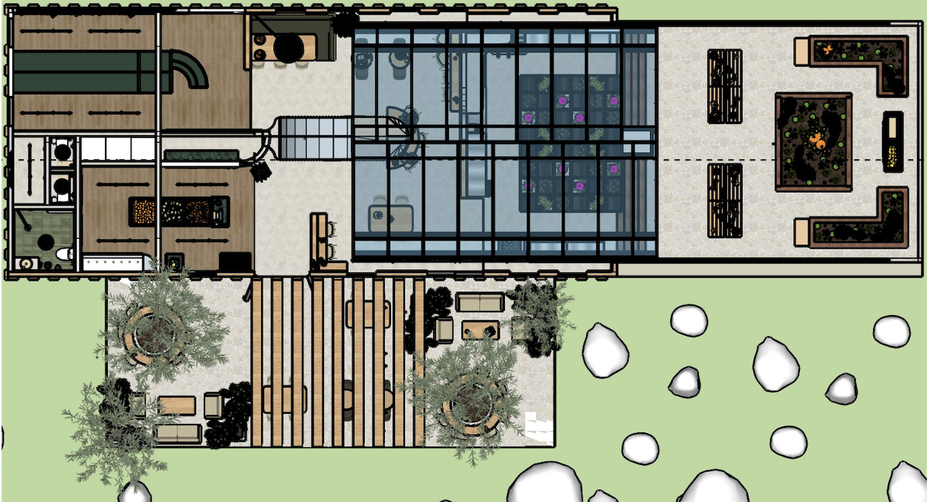
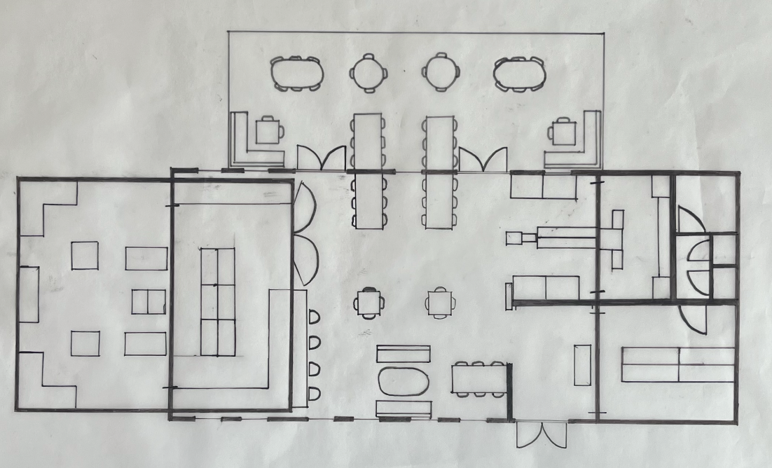
Floorplan
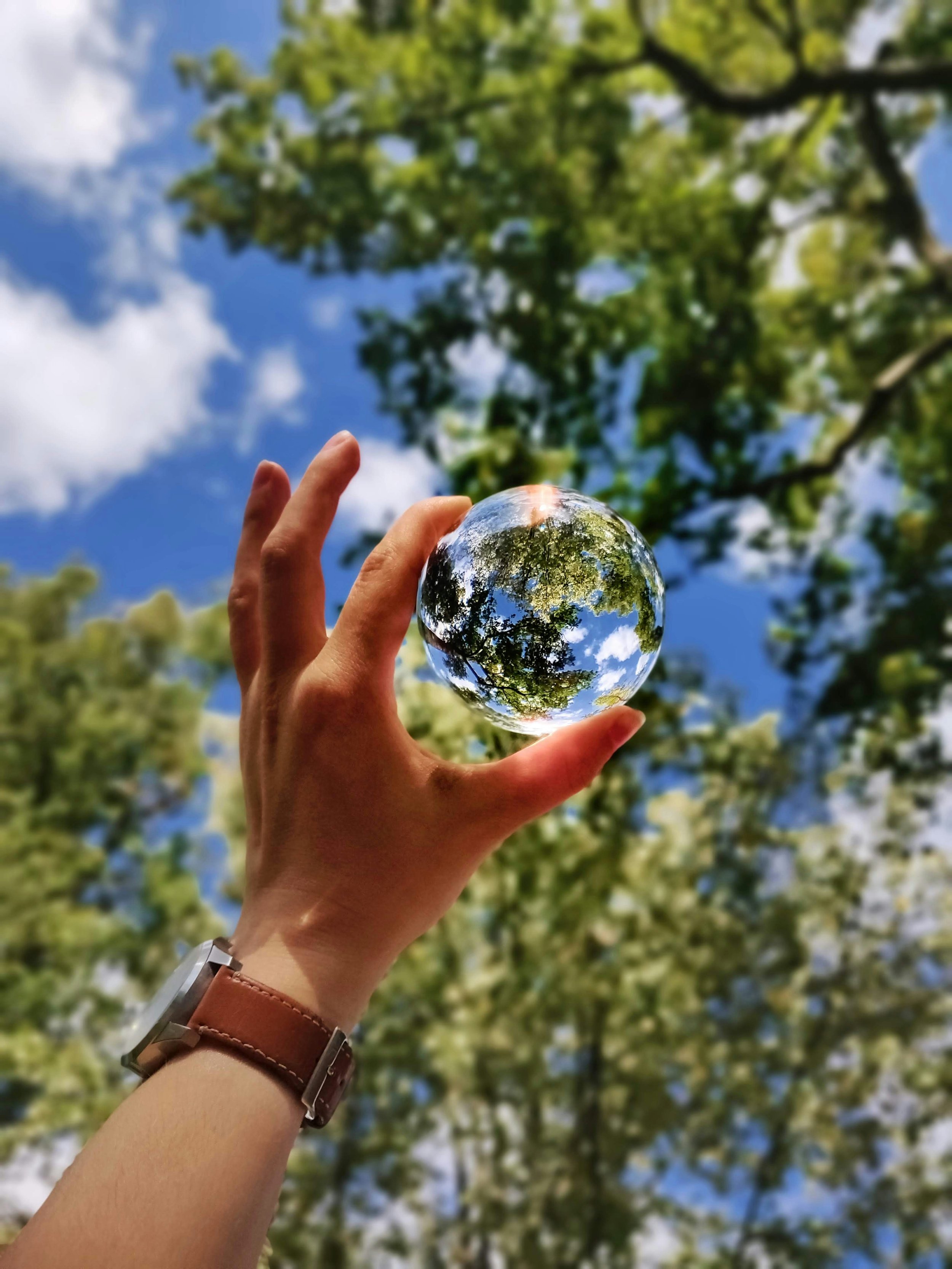
Design inspiration
Fluid and intuitive flow
To create a fluid and intuitive flow in the TooGoodToGo restaurant, I designed a space that reflects circularity, through the choice of materials, colors, and the way the interior connects with the outdoors.
The main materials, wood, concrete, and steel, express sustainability and natural character. Wood and concrete show their beauty through grains and imperfections, while steel provides strength and durability. Combined with nature-inspired colors, greens, beiges, and the blue of the sky visible through the surrounding woods and greenhouse, the building reflects TooGoodToGo’s values throughout.
Inspiration to design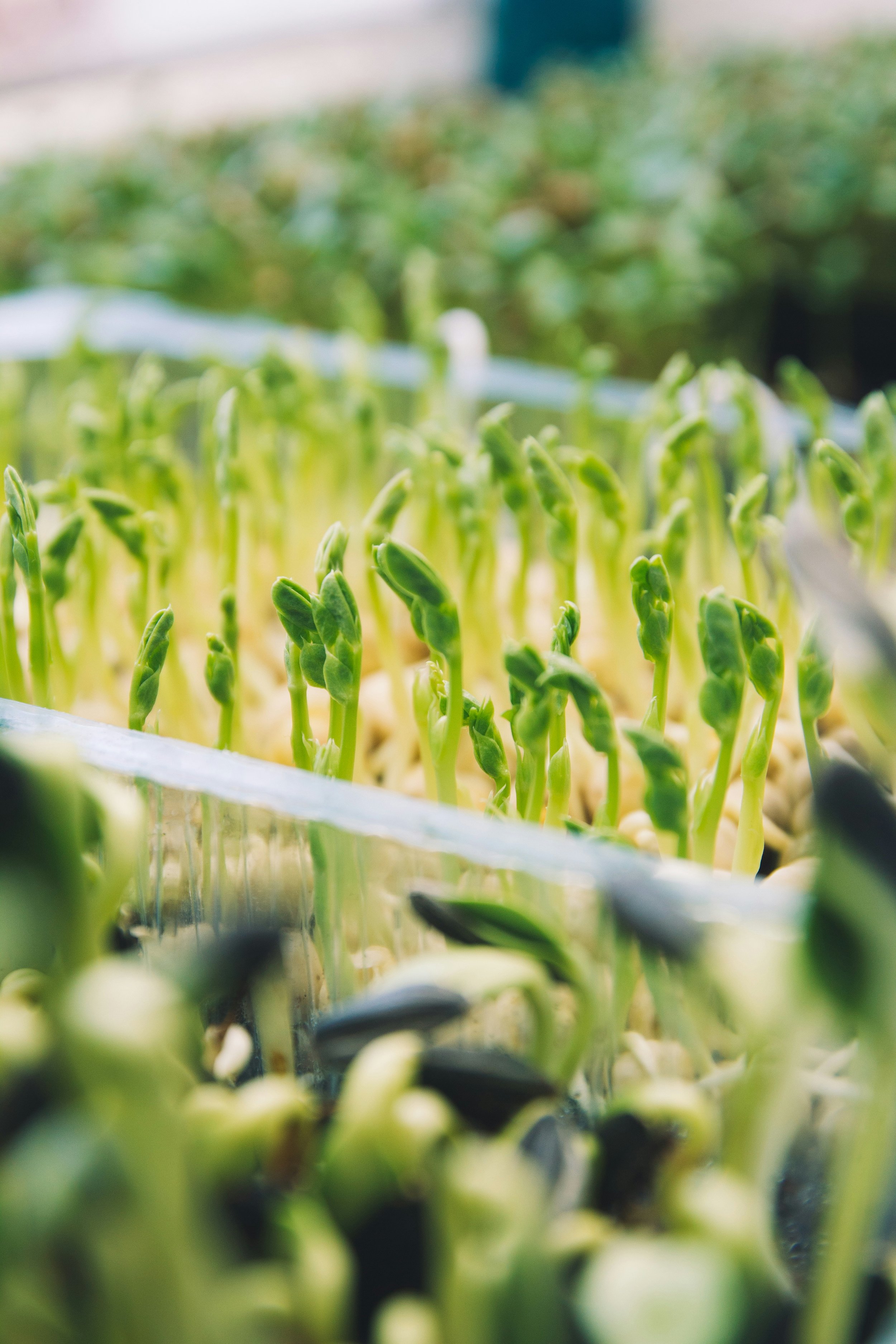
Local production
Too Good To Go is focused on sustainability and changing the way we eat and produce food. The platform supports local farms by providing a way to sell surplus produce, reducing food waste and lessening the need for overproduction. It also addresses broader food system waste, which indirectly helps farms by discouraging unnecessary overproduction.
To reflect this mission, I incorporated a greenhouse into the restaurant, allowing chefs and workshop participants to use mostly locally grown produce. A shop inside the restaurant also sells surplus produce, further preventing waste and overproduction.
Through cooking workshops in the kitchen, visitors can learn about local ingredients and experience them firsthand, fostering a stronger connection to sustainable, local food. Change may not be made by one, but it begins with one; may this restaurant be the start.
Inspiration to design
Inspiration to designWelcoming
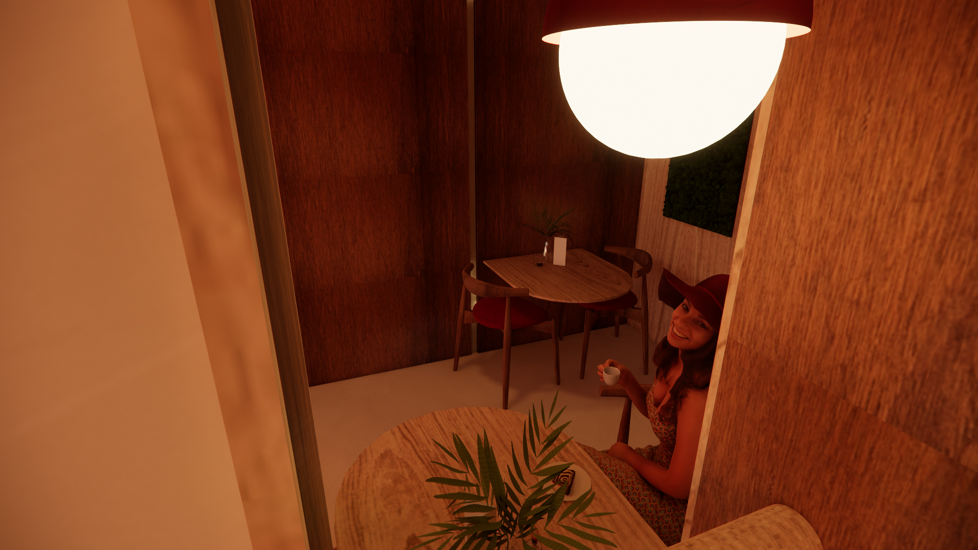
Too Good To Go is committed to inclusivity, creating a space that is welcoming and accessible to everyone. Sustainability is for the entire population, not just a select group.
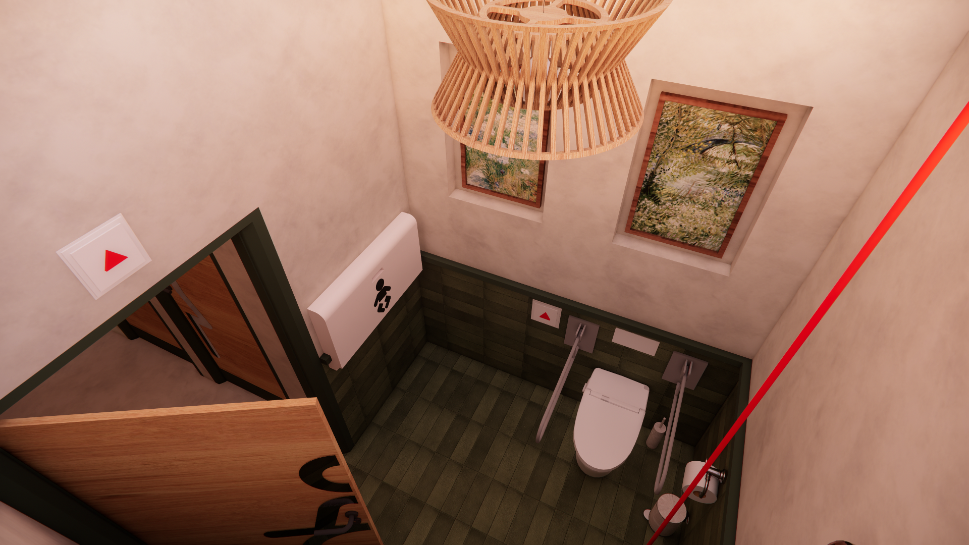
I designed a friendly and cozy atmosphere using soft, warm lighting, combined with practical choices such as wheelchair-accessible corridors and lifts. Large seating areas accommodate families, emphasizing that community lies at the heart of inclusivity. The restaurant maintains a neat yet soft appearance, avoiding harsh or overly stylized aesthetics, to ensure that everyone feels welcome.
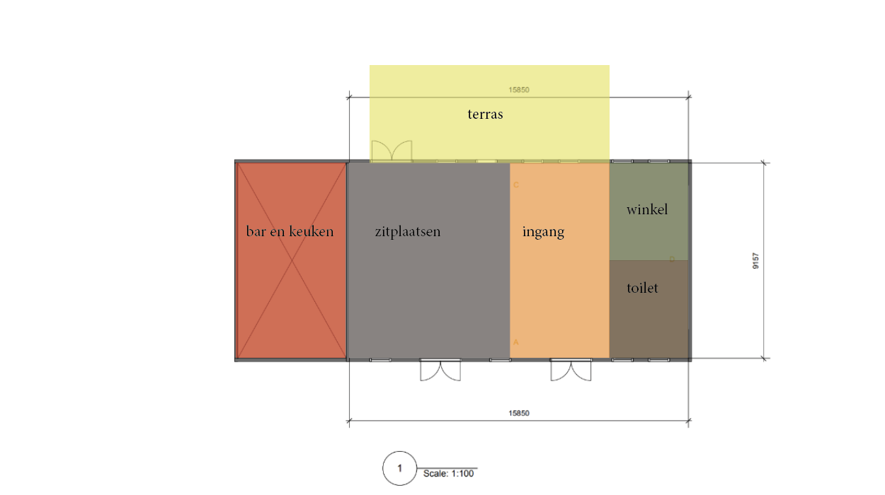
Space analysis
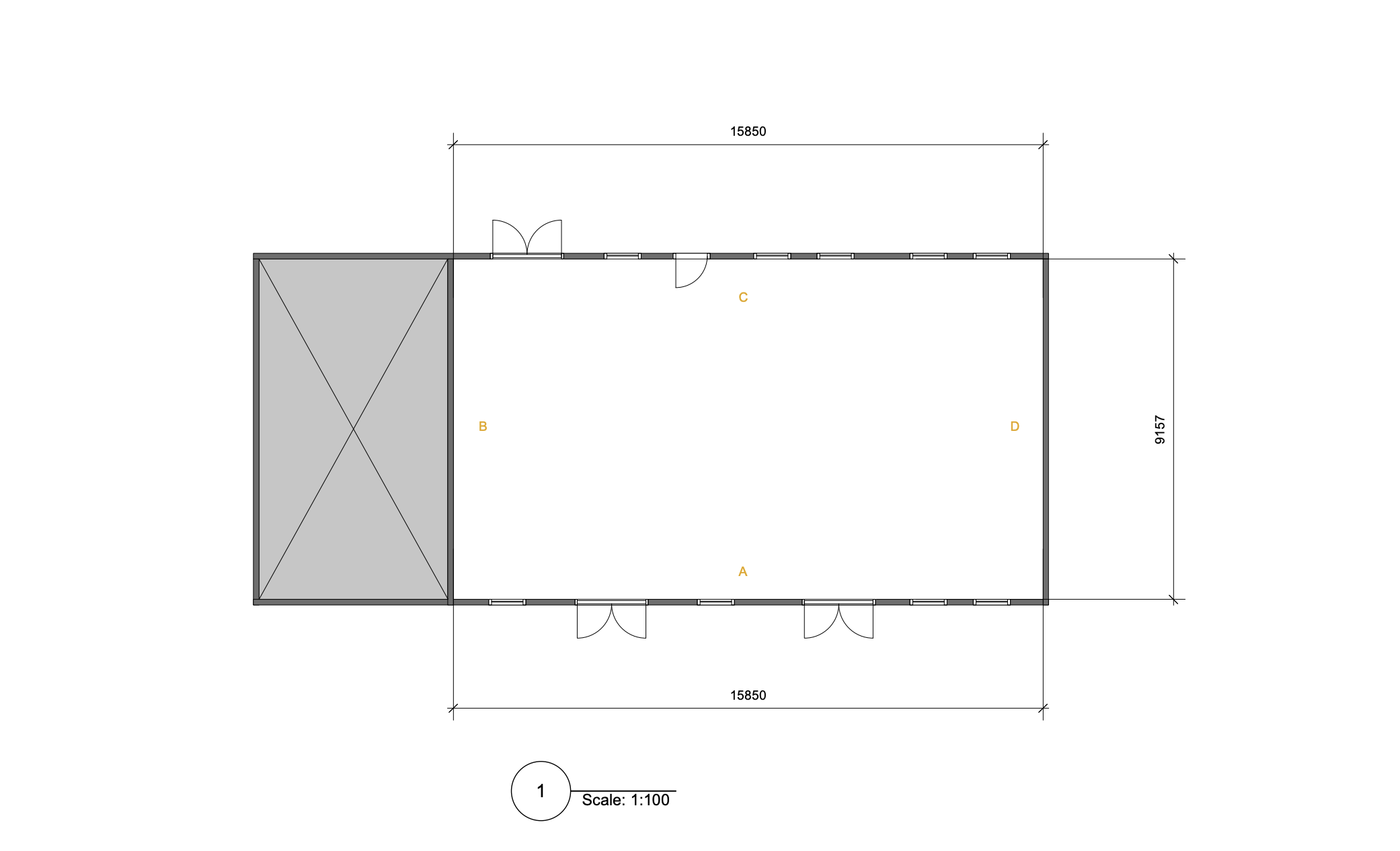
Original measurements of the agricultural building without the new greenhouse exstention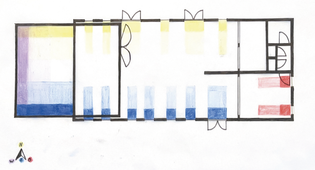
Daylight analysis.Dark coloring = winter sun. Light coloring = summer sun.
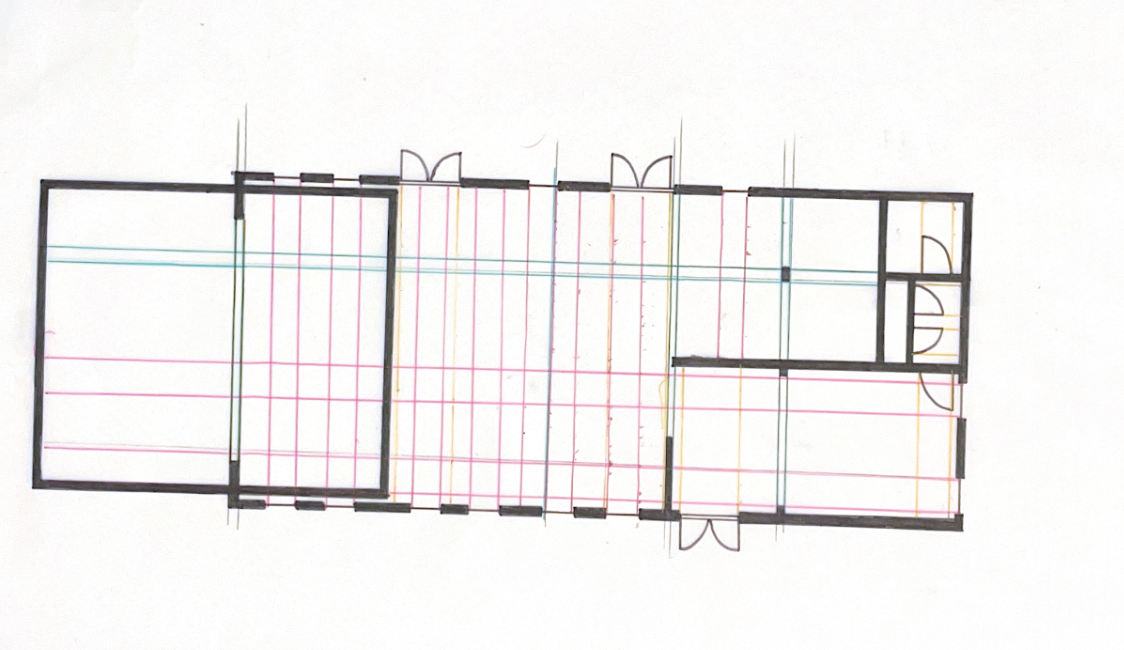
Design line analysisOrange = Windows & doors. Pink = Walls. Green = Pillar
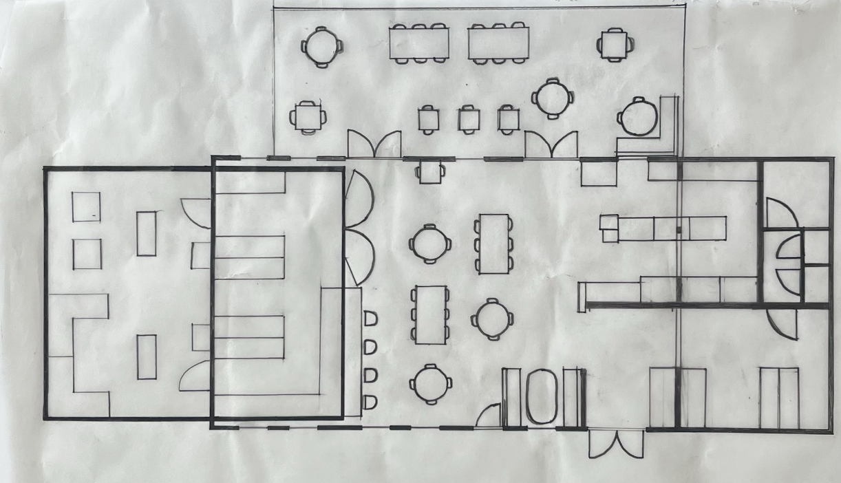
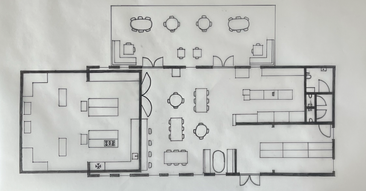
Layout sketches
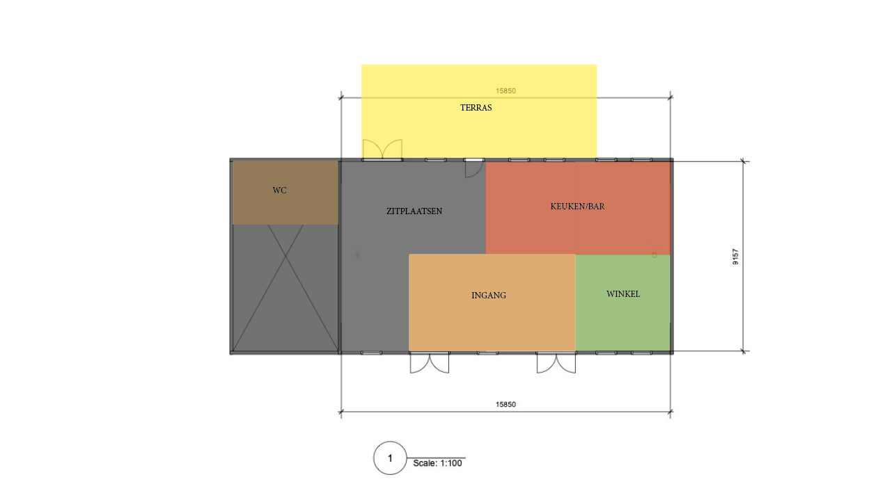
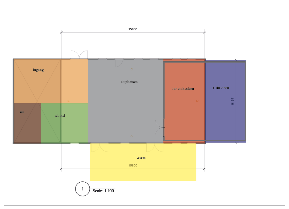
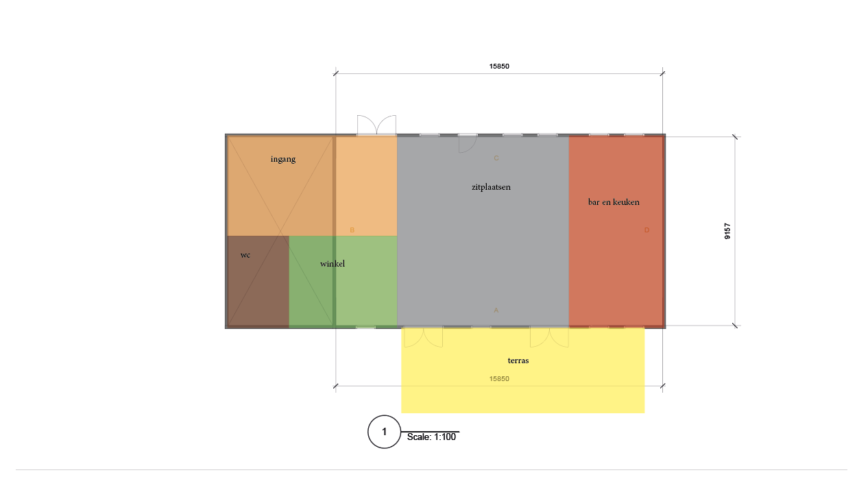
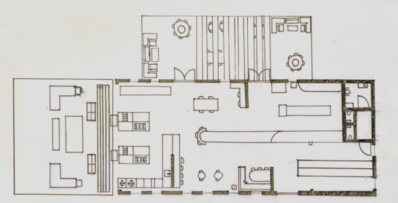
Definitive layout & additional information
Definitive layout TooGoodToGo Restaurant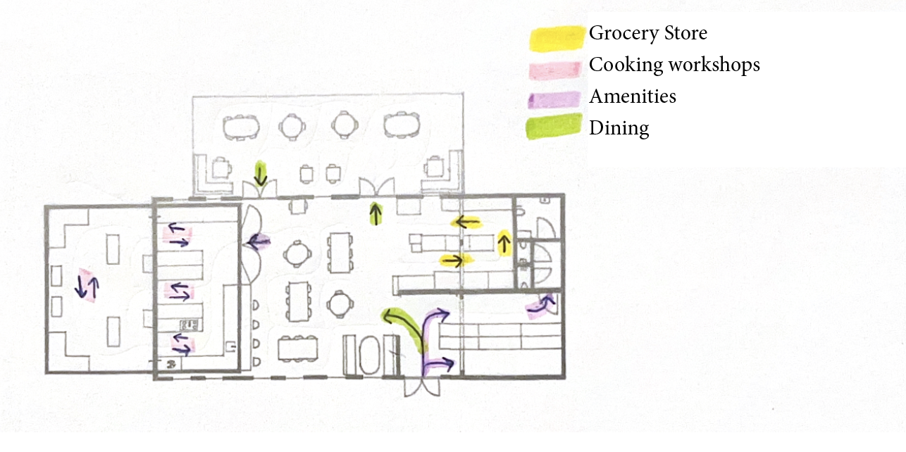
Routing of TooGoodToGo Restaurant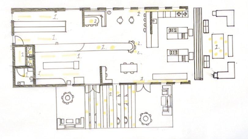
Light distribution of TooGoodToGo Restaurant
Armed Angels
Japanese Retreat
Han & Lotus